I wanted to try something a little different with a custom I was working on. For the longest time I’ve enjoyed seeing the work of a fellow by the name of Tyson Beck. You might not recognize the name right off the bat, but you’d probably recognize his work. Topps hired him to work on the “Fire” brand of inserts and cards. The overall look of the “Fire” brand of cards changes from year to year, but on the whole they usually involve both geometric abstracts as well as paint/dust/particle effects. Some would say “paint splatter”, others “grunge and dust”, I just call it fantastic and inspirational. I was using the “Fire” inserts specifically from 2016 Update Baseball as inspiration.
So, with that said, and with literally 100 different “paint” brushes in photoshop, I came up with this…
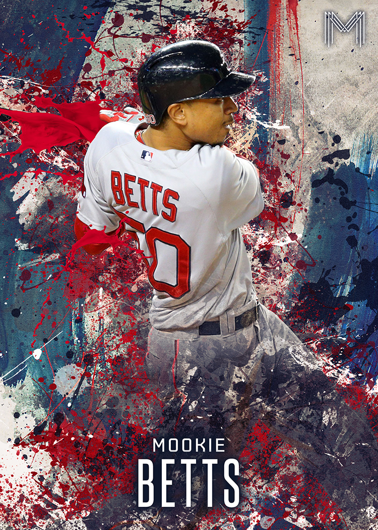
This looks awesome! I’d buy a card that looked like that.