T-Mobile G2 Review
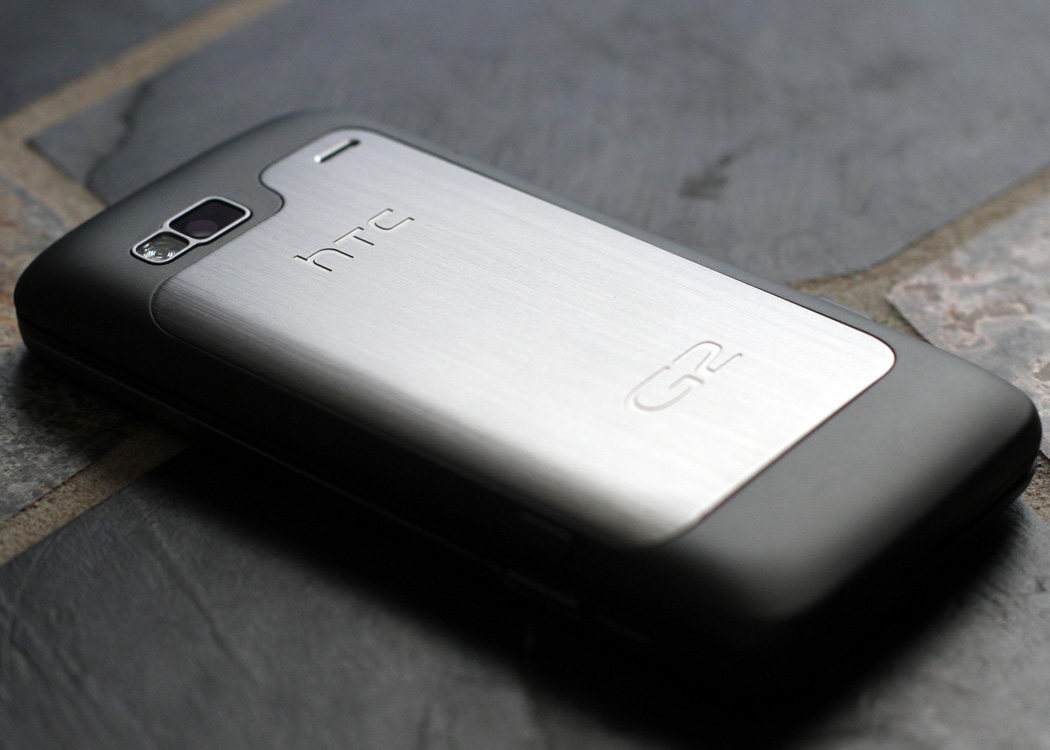
Having realized it’s been 4 years since I purchased a new cell phone, and having long since finished my obligitory 2-year contract I felt, with a baby on the way, that it was time for an upgrade. My phone of choice was a T-Mobile G2. Made by HTC and licensed to T-mobile exclusively in the US it’s also know as the HTC Desire Z internationally.
It’s one of T-Mobile’s first 4G phones and is capable of some serious speeds. Having wondered into a 4G area only once so far, it’s been running mainly in 3G for most of my experience so far. I can’t wait for the network to expand so more people can really take advantage of the increased bandwidth.
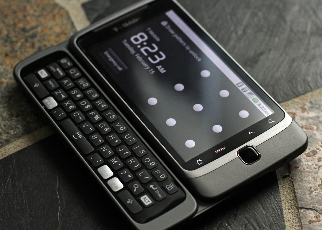
Design wise, it’s nearly an identical size and weight to an iPhone 3G, with the one major difference being the slide-out keyboard underneath. Having used a SideKick for numerous years, I have to say I was amazed by the fluid motion of the keyboard. I didn’t think anything “hinge” wise could really stack up to the SideKick, but this far exceeded my expectations. In general I think the phone is exceptionally well built and should stand up to all but the most severe handling.
Software wise it’s 99% stock Android. Froyo to be exact. T-Mobile added a plethora of apps to get the basic user started, perhaps even too many. All the Google apps are installed, including some lesser known ones like Latitude, Goggles and Sky. The downside is that since they’re all factory installed, they can’t be deleted. I’m not sure when I would ever use Google Sky to look at constellations, but I’m pretty sure I’d like the option to uninstall it if I wanted to. Others like Google Shopping, Maps, Gmail, etc are all fine and come in very handy. I could almost see them being locked in, but there’s just no excuse for some of the random stuff. You can always delete the shortcut/icon to the apps, but they’re still on the phone taking up room.
Also, it should be noted that in order to get the full experience on this phone, you really need to have a solid Google account already established. The very first thing the phone asks you to do is sign in or create a new Google account. Your contacts are synced and backed up within Gmail, you can access you voicemail using Google Voice, you can chat with Gtalk, you buy things from the Marketplace with Google Checkout, etc. It’s all tied into your Google Account. This is both a pro and a con (if you’re keeping score). While it’s VERY handy to have a cloud backup of everything, you also have to have a Google account that’s fairly junk free. Having my own domain, I use gmail addresses 99% of the time to block spam. I have several. Every time I sign up for a new website, I use my gmail address. It keeps my normal inbox nice and tidy.
Initially this caused me a couple problems. I’ve had to “clean” a gmail account for specific use on this phone. Sure, I could have just used my normal email address, but since everything is tied together, I didn’t want my Google Checkout purchased mixed in with my Threadless T-Shirt promo newletters. I also didn’t want to get all that garbage on my phone either. So, I cleaned up an account and unsubscribed from everything that was coming in and so far it’s been very trouble free.
The other interesting bit involves contacts. Your phone contacts are synced with your Gmail contacts. You change one, it changes both. Kind of a pain if you’re importing phone contacts and you already have the same person as an email contact. It’s not terribly accurate with assigning phone numbers to email addresses and vice-versa. The upside is that you can also manage the entire mess IN Gmail. About 15 minutes worth of work and I had everyone’s phone numbers and email addresses lined up where they should be. The changes were instant, so as soon as I picked up my phone, the changes had been made. Again, this is also great for backup purposes. If I ever misplace the phone, or it dies somehow, all the contacts are ready to be restored right from Gmail.
I also wanted to point out some of the cooler features of the phone. If you have (or have seen) an iPhone, you’ll be familiar with most of these features, so this is mostly a good explanation of the differences between the two platforms.
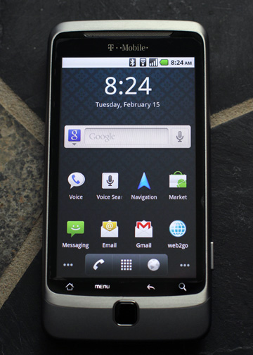
Lock Screen:
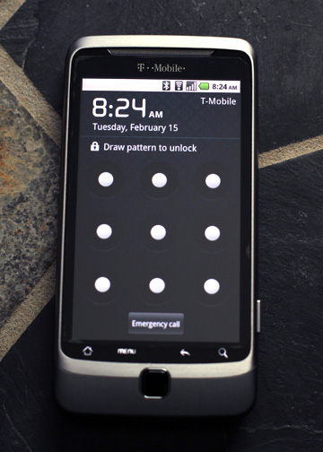
I really liked the options for the lock screen right off the bat. You can choose from 4 styles of locking. The first is a “slide” unlock, similar to the iphone, with no security options. Next there is the alpha-numeric password/code unlock. Third is a “pin” unlock (again, similar to the iphone, 4 numbers to input). Lastly is the pattern unlock, which is my favorite. You can draw a pattern through points on the screen to create your own unique pattern, which you repeat to unlock the phone.
Home Screen:
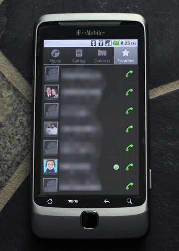
Next thing you’ll see is a VERY stock Android home screen. So much so that even the famous “Android Clock” is missing (the one you see in nearly every TV commercial, the big “flip clock”). It can be easily added as a “widget”, but it’s up to the user. A curious choice by T-Mobile to omit, especially considering the additional software, but an easily forgiven oversight. Next you’ll see the normal array of icons. All the important applications (the default ones) are accessible from the the start. Gmail, regular Email, Text Messages, Web and Navigation are all on the first home screen. There’s also the Google-Bar, which serves as a search mechinism for everything. It can search for things on the phone, things in your email, things on the web, etc. It’s similar to Spotlight for the Mac. Also, towards the bottom of the screen are the 3 most used features. Phone (including Contacts), Apps and Web. At the very bottom, beyond the screen (on the phone itself) are also 4 buttons for navigation. Home, Menu, Back and Search. Menu is really the only one that needs claification, but only the the extent that it opens the menu inside each application you’re in. Similar to the Apple menu on a mac. The options change depending on what application you’re using, but the menu is always in the same place.
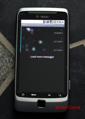
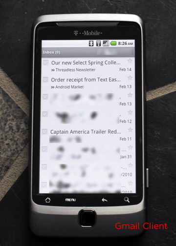
Email & Gmail:
Separate applications that access their respective mailboxes. Both designed differently, which is an odd choice aesthetically. The Mail app, which you configure with your own pop/imap/exchange email has a black background, light-gray text and generally looks more austere than it’s counterpart. The Gmail app by comparison has a white background with dark-gray text and generally looks more friendly. Both are full featured email clients, both use similar composition screens, etc. It’s just the general look and feel that’s different. Perhaps they chose that so that you’d always know what application you were using.
Text Messages:
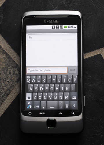
So far everything about the phone has been great… but no we get to the Text Message app and we take a rather ugly turn. The TM app is broken and pathetic. Compared to my Motorola W490 (a simple flip phone), this app is a step backwards in design and technology. Perhaps the designers were assuming that you wouldn’t need to text any more since you can tweet or face-book-plant people or some such nonsense. You don’t have any option to select a contact for messaging. You either have to type in their full name or remember they phone number, area code first. Also, there’s no way to select more than one person to text in the first place. Since there’s only one “To:” field, you can only send it to one person. Technically, you can add a comma and type a second name, but you don’t get a menu to select the person from so you have to get it exactly as it appears in your contact list. Should you have gone through all that trouble and are trying to send it to more than a few people, apparently the app crashes (requiring a hard reset) if you enter more than 6. After all that trouble, the texts are stored as “conversations”, in a chat like hierarchy, but not with any organization.
Sadly, the default text app just doesn’t cut it. Given that I bought this phone to send out a massive “the baby is here” text/email when the time comes, that kinda screws me over. Thankfully, I’m not the first person to bitch about the lame text app and there are several replacements to choose from. I chose “Text Easy” for $0.99. Right off the bat it’s a vastly superior app. It’s technically a front end replacement that uses the send/receive functions of the built in app, but it opens into a list of contacts and lets you chose, via checkbox, who you want to message. You can also predefine “groups” back in Gmail and while the default client ignores them, Text Easy recognizes them and lets you send out texts to entire groups in your address book. Very handy, especially for me in this instance. Well worth the $0.99.
Camera / Gallery:
Another weird design choice was separating the camera from the picture viewer. The Camera app just takes photos. It does have a pretty wide feature set (for a phone) including exposure compensations and white balance options. Reviewing what you’ve shot lets you flick through them one at a time, but not organize or do anything with them. With Gallery, you can organize photos into collections and folders. Until you do, they’re floating in this sort of blurry ethereal space, which is kinda trippy, waiting for you drag them into folders. It’s from here that you can set things as wallpapers or contact icons. Kind of weird that they separated the two apps, but much more forgivable than the text message issue.
Additional Apps:
While we’re on the subject of other applications, there are a choice few that I’ve already installed that I’m enjoying quite a bit, and a couple preinstalled ones that I’m finding more useful that I thought I would.
Goggles – From Google (and preinstalled), it lets you take a picture of just about anything that’s an actual object (item that you might have purchased, not a person) and it’ll find it. Can recognize product logos, tags, barcodes, etc. Just from snapping pictures of things on my desk, it knows where to find more Mt. Dew, Sharpies and Compact Flash cards.
ShopSavvy – Nearly the same idea as Goggles but for scanning barcodes and finding deals. Scan a barcode and it’ll tell you where you can find it nearby (or online) and for how much.
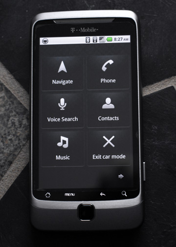
Car Home – Turns the phone into a Sat-Nav/Car Phone. Six big buttons replace the entire interface and can let you make handsfree calls, navigation and directions or listen to music. Especially cool is the speech recognition part, where you just hit the button and tell it where you want to go. Worked really well in my somewhat noisy car when I tried it out. Got the address correct on all three attempts.
ScoreCenter – From ESPN, essential for getting sports scores. Simple and to the point. However, in a related subject, I was fairly disappointed to find out that there was a fantasy football app, but not a baseball one. For shame ESPN, gimme my fantasy baseball! Maybe Nagle can work on that.
Banks – That’s not that name of the app, I just wanted to point out that nearly every major bank has an android app, which all seem to work similarly and are all fairly handy. Beats having to text “#bal” to my bank in the past.
DropBox – The always popular cloud app on the go.
Amazon – Since I signed up for Amazon Prime, I order things from Amazon all the time. The app is just a shortcut to my addiction. Free two day shipping and “Insta-Buy” at the touch of a button, yes please!
Kindle – Since I have an actual Kindle, the app seemed kinda silly until I realized that since my Kindle doesn’t have 3G, but my phone does, I could buy books on my phone and they’d appear on the Kindle when I got home. I can also organize my library and set things to download on the go. Sure, you could actually use it to read, but I’ve got the real thing for that. I just like it from an account management stand point.
WordPress – Do I really need to mention that one? lol. Awesome as always.
SnapTax – Here’s a weird one. From Intuit, makers of TurboTax. Since my kiddo isn’t here yet, and I have a pretty strait forward return, I usually file a 1040 or 1040EZ. I did my taxes, on my phone, in under 10 minutes. You can TAKE A PHOTO of your W2 and it imports all the data. No joke. It actually worked. App was free, but it’s $14 to file, which is still cheaper than the $20 TurboTax Basic.
Hardware:
Lastly, I feel I’d be remiss if I didn’t mention my experience with a slight hardware malfunction when I received the phone. When you get it, the 8G SD card comes preinstalled. It’s located under the battery, in the back of the camera in this tiny, spring loaded hatch/frame thing. One of the first things I did was plug the phone into a computer and tried to transfer some wallpapers and music to the phone (music to use as ringtones – PS: Jason, you’re ringtone is Teenage Bottlerockets, lol). Apparently this threw the phone for a loop. There are specific places where things go and, since there are no instructions on doing any of this, I apparently got one wrong. This bricked the SD card. On the phone itself it kept giving me an error that the SD card was “unmounted”.
So, I called tech support. They told me to “remove and then reinsert” the SD card because that would “reset it”. One, flash memory doesn’t “reset” by being removed and reinserted, but that’s neither here nor there. Second, that tiny spring loaded housing that actually holds the card would not budge. At all. It was stuck. The tech suggested I take it to my local T-Mobile store and they could help me there. I decided to Google it instead.
As much as I love T-Mobile’s service, I can stand to walk into a store. Not only are the people completely dim, but the customers are either angry black ladies with attitudes or clueless middle-managers wanting the CSR to transfer all 5000 of their contacts. I can’t deal with being in line behind either of those two groups.
Luckily, the internet is a sea of information and it turns out that the specific latch with which I was doing battle is a known design flaw. It doesn’t open about 50% of the time. The real solution to the problem was to remove the files I added to the card and start over. I didn’t even have to reformat the card. I just moved the files to a different location. Apparently, the Gallery app wants to control your photos, but wants nothing to do with them if they’re in the directory called “Photos”, go figure.
I realize it might be a stretch to fully support the adding of various type of media to a phone, but simple instructions should probably be given in the damn manual. Otherwise, thick people such as myself might actually think that the “audio” folder is where music goes and the “photos” folder is where pictures go. Or, alternatively, just as a suggestion, don’t name important system folders at the root level things like “photos”. Just a thought.
That little snafu aside, the phone has been a pleasure so far. Even little things like the charger are actually well thought out. The charger consists of a USB cable (normal to mini) and a small wall-outlet plug that you can plug the cable into. No more proprietary cables! Yay! I’m actually changing the phone using my Kindle cable as we speak. That also means that the massive collection of USB cables I already have can actually be useful. I have one at the office, one at home on my nightstand, one in my laptop bag, etc. It’s nice when companies actually realize that proprietary plugs and cables just makes things I giant pain in the ass.
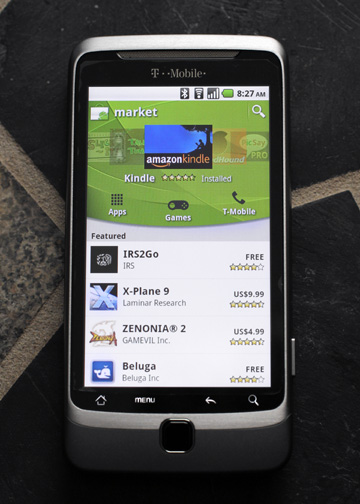
In the end, I’m very pleased with the phone so far. The hardware is solid (almost too solid), it has a nice feel in my hand, the apps are snappy and responsive. The OS is quick and full featured. It’s stock Android so it’s easily upgradable later. The app store is full of interesting stuff, usually for fair reasonable prices. I’ve only purchased two apps so far, both have been well worth the $0.99.
Final Score 8.5/10.
A few minor glitches here and there but otherwise the best phone I’ve had in a long time.
Recent Comments