The way I approach a custom card might be slightly different than most. For starters, if I’m doing a strait recreation of an existing card, it’s to fill a gap in reality. If a person didn’t get a card in a certain year, or on a certain team, that’s a good candidate for a custom. Second, if I feel like the idea was a good one, but I thought it could be executed differently design wise. That’s the nice way of saying that I didn’t like something about the original. That’s not because I believe in any way that I’m a better designer than any of the artists already employed by Topps or Panini, but merely that they have deadlines and productions schedules to meet, whereas I could take months working on something. The third type of custom is the original custom. I love being inspired by a design and then putting my own spin on it. I’ve got a few of those in the works, but this post is actually about the second type.
Topps created a design for this years Olympics cards that was pretty good, but had, at least in my opinion, a few things that needed tweaking. So, this is my re-imagining of the 2016 Topps Olympic card set.
First lets start by taking a look at the original, and pointing out the few trouble areas I noticed. As always, click to enlarge all these. They’re better when they’re bigger.
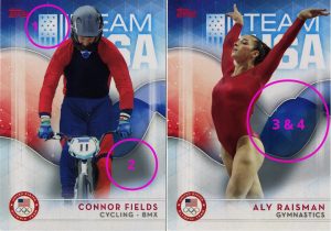
So, here we have the actual cards for Connor Fields and Aly Raisman. I picked these two out of my set because they highlighted three of the problems perfectly, and the other was on every card.
- Let’s start with the flag. That isn’t 50 stars. Also, after consulting the actual rules for displaying a flag, to the best of my understanding, the flag can be displayed on either side, so long as the field of stars is in a “forward moving” orientation. For example, on a race car, on the window, on the drivers side of the car the flag would be displayed in the orientation we typically think of (stars in the upper left). On the passenger side of the car, the stars would be in the upper right, towards the direction in which the car would normally travel. I’m not sure who made the call on the orientation for these cards, but upside-down and backwards isn’t a normal direction for the flag.
- Second, the shadows under/beside the athletes are ridiculous. Normally I wouldn’t be complaining about something like a drop shadow, but look at those! Way too dark, way too big, and from completely nonsensical directions.
- The third issue is with that shape behind the atheletes. I have two problems with it specifically. First, a smooth, organic, curved shape has no place in an otherwise entirely geometric design. There is literally a grid on the background, and withing the shape itself, but yet it just wonders across the design like no one gave a flip.
- The other issue with that background element is the design of it itself. What the hell is with those two bumps on the right, followed by that sharp hairpin turn at the very end? I suck at Illustrator, but even I could have come up with a better “wave” shape than that.
- The last issue is something universal to the set. The photos used, and the athletes chosen were all done months (or in the case of the photos, years) ahead of the actual games this summer. The set debuted a month before the games even happened. That’s why it was technically called “US Olympic Team Hopefuls”. They didn’t know in a number of cases who was actually going to be on some of these teams. They also didn’t know who was going to win a medal. They also didn’t have photos of the athletes at the games or, in the very least, in the appropriate 2016 gear. In my opinion, there should have been proper photo shoots before hand, and photos from the games included in the set, and the release date pushed back a month. They could have shorter printed the whole thing, designed cards on the fly based on who won what, and got the printing presses rolling the day the games ended, and included things like autographs and relics as redemptions.
Ok, criticisms out of the way, what are we going to do about it?
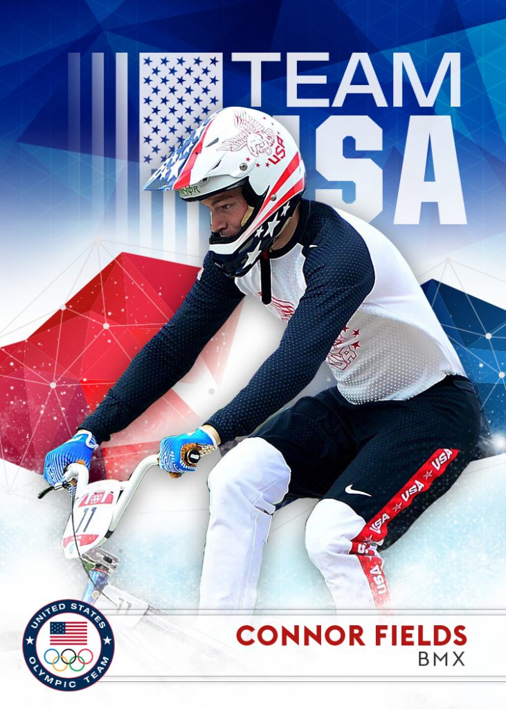
Well, let’s start by fixing those issues we just talked about. The flag is now the correct flag, in the correct direction, with the correct number of stars. The drop shadows are reduced by 2000%. The background is now made up with a geometric shape and the grid pattern behind that has been considerably reduced (opacity wise). That’s also a picture of Fields AT the Olympics.
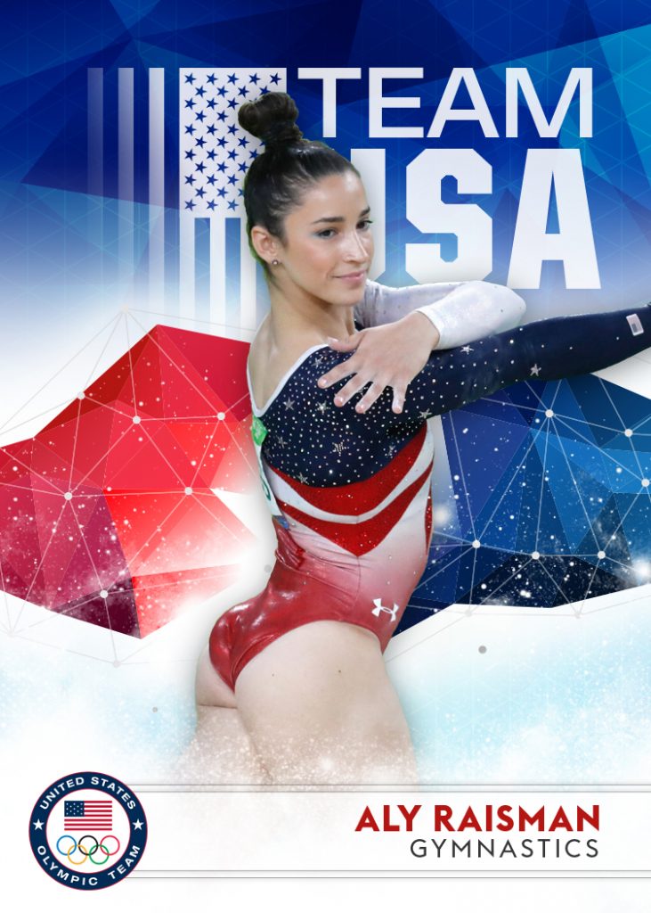
Here’s Raisman, again actually competing at the Olympics.
How about a couple more?
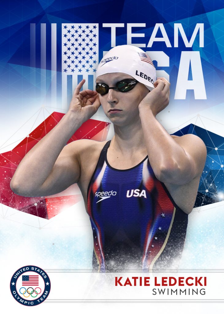
Katie Ledecki version, who’s original card, if I remember correctly, had her in a warm up jacket.
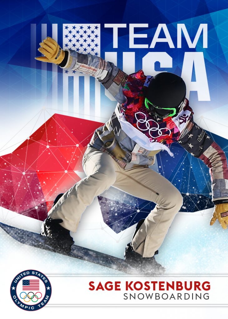
But why limit ourselves to the summer games? The winter games are awesome too. Why not make a “best of USA Olympics” set?
Here’s Sage Kostenburg from the snowboarding team.
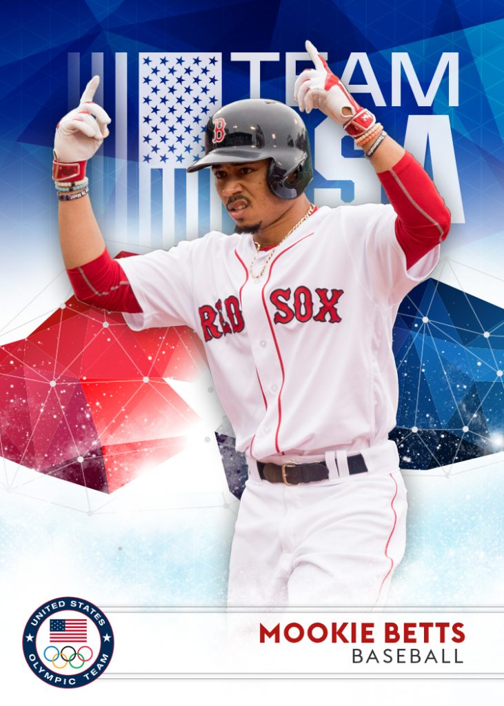
What about baseball? Baseball is coming back for the 2020 games in Toyko, we’re obviously going to need some representation there too…
Couldn’t resist. lol.
Hope you enjoyed these. I’ve got more customs in the pipes as well. Stay tuned!

These are cool! Great work!
Thanks dude!