With the release of 2017 Gypsy Queen a week or so away, I’ve been preparing my now-traditional “recreation” of the cards. It’s a fun exercise for me as a designer. I try and deconstruct a card, it’s design elements, font choices, photography effects, etc. It’s a way to exercise that creative part of my brain. Yesterday Topps updated the “sell sheet” and released a more-or-less final checklist before the products launch, which is fueling this design breakdown. PDFs, in case you weren’t aware, are considerably easier to pick apart than low-res JPGs they normally put out for previews.
If you have no interest in what fonts Topps is using this year, feel free to tune out for while. For those of you who might be curious, let’s rip into this puppy.
For starters, if you’d like to follow along, grab the PDF Sell Sheet from Topps, or Blowout, or by clicking here.
The first thing I usually do is open PDFs in either Photoshop or Illustrator. If whoever put the PDF together didn’t flatten the file entirely, sometimes there’s some tidbits you can discern right off the bat.
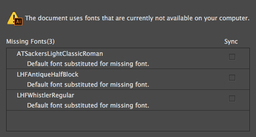
And there we go. Those are the three fonts someone used to put together the PDF. That doesn’t necessarily translate to the card, but it’s a great first step. In this case, “Sackers Light Classic” was used in the body of the PDF, and doesn’t appear on the cards, so we can ignore it (unless you’re looking for another generic serif font). The two we’re interested in are next.
LHF stands for “Letterhead Fonts”, a brilliant font foundry that produces gorgeous retro fonts. Antique Half Block (link here) is a chunky “display” font, great for signs and whatnot. It’s used in the PDF as an accent. I can’t find any evidence of it on the cards themselves, but it’s always good to have a good complimentary font in your back pocket that goes well with your primary.
Our primary font, both used on the sell sheet AND, as I’ll show in a minute, on the cards themselves is LHF Whistler (link). A remarkable “1800’s inspired” font. Completely perfect for a card trying to tie itself back to that time period.
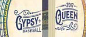
Whistler is used extensively throughout the product this year. It’s used on the box (above), the name plates on the base cards…
…on the booklets, both inside and out…
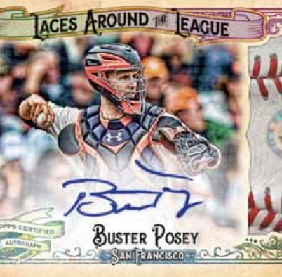
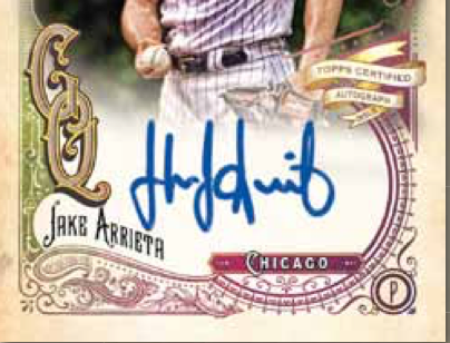
…as well as on some of the insert cards, including the relics and autograph cards…
You can see in those last two examples a pretty good variety of letters and variations on the font, both solid, outlined and embellished with decoration. I can say, with almost 100% certainty, that Topps is using LHF Whistler in this design. That’s not a knock on Topps either. It was a brilliant font choice by the designers. Kudos to them.
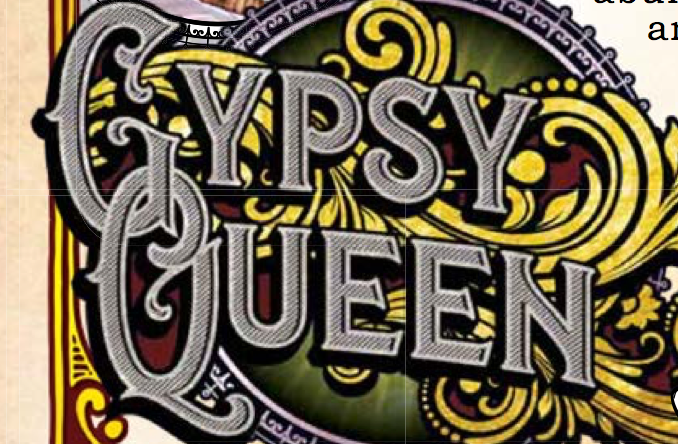
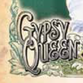
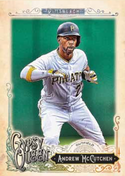
There is one thing we haven’t talked about yet though: the base cards. That’s because they got a little sneaky on us. While 90% of the cards are featuring Whistler in some way, the base cards look like this…
“Well, that’s pretty close” you’d say, and you’d be right. I was going to write it off until I really started looking at it. I thought it was a variation, some alternative characters in the font set, but it’s not. Look at the G and the Q in that example and the autograph example above. The characters on the base cards are considerably less ornate. Now look at the E’s in Queen and every E in the examples above. Completely different. That’s because it’s not Whistler. It’s LHF Elixir (link). Sneaky designers. My guess is that they tried Whistler and at some point someone designed it was too ornate with all the decorative elements in the frames around the cards.
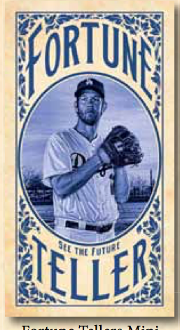
So, now you know. Two main fonts, and it depends on the cards. The base cards are a mix, using both fonts. The hits seem to be mostly Whistler. Some of the mini cards and “other” inserts however…
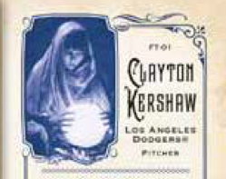
That’s Elixir again. It’s the lowercase version of the letters, distorted and bent around the frame, but that’s definitely it. Oddly, the back features Whistler again…
Yes. I know. I’m font geek. I have an addiction. Don’t judge me. I blame art school.
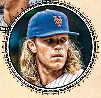
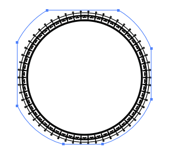
There’s one other nugget we can pull out of the sell sheet PDF as well. In a lot of the designs a circular frame is used repeatedly. Apparently they wanted to carry that into the product information as well, so someone used the actual vector object and embedded it in the PDF…
This circle appears on the hobby boxes, the autograph cards, the booklets, and a half dozen other places. That element is extractable right from the PDF. See…
Thanks Topps! That should come in handy.
The vast majority of the rest of the design are “retro” design elements, mostly stock “frames” and “ribbons”.
If you’re looking to make your own this year, I’d suggest searching around various stock sites for those keywords. You’re looking for “vintage” frames, borders, etc. I’ve found a good number of similar pieces for my own recreation, but unfortunately I can’t provide them as they’re paid stock resources, but they are definitely out there to be found.
Add all that to my previous photo editing tutorial (link), on top of an “old paper” or grunge texture (remains to be seen from the low-res previews) and you’ve pretty much recreated 2017 Gypsy Queen.
My guess is that I’m never going to be able to find the EXACT pieces that make up the frames, so all my attempts this year will be merely “inspired by”, with my own variations. If you really want to get an exact copy of these frames, you’ll probably need to find some real cards once they’re released and scan them. You can always cut out the player and recreate the name plates with the fonts we’ve talked about. That’s my best recommendation if you’re looking for a exact recreation.
Hope you enjoyed our little design breakdown. I’m looking forward to making some of my own GQ here in the next couple weeks. I’ll try and put together another tutorial this year to cover my own variation on them.
Thanks for reading!




As someone who took more than a couple graphic design courses in college, this was a fascinating look into the minutia of baseball card creation. Also, as someone who fancies himself as an amateur baseball card maker, this information may prove to be quite valuable. Thank you for the taking the time and to sharing your research with us!
Glad you liked it Tony! I’m glad someone might find it useful. I can’t wait to get some final product in my hands so I can try and figure out what some of the smaller details are. Thanks for reading!
I can’t do this worth a damn, but always enjoy seeing you break these down. Good work!
As someone with no design know-how, this was an interesting look at the design!