I’ve been having fun lately with my customs. It started as a way to create cards for sets that should have existed. Missing players, deeper rosters, that sort of thing. Not every set can have 700 cards, but my imaginary additions can fill in the gaps. Then it sort of evolved into this exercise of creativity whenever I was lacking it. My day job is that of a web designer, but I’m only actually “designing” a new site every few months. The rest of the time is the actual building of a site, adding content, manipulating text, changing code, adding links, that sort of thing. So, while editing CSS all day can be rewarding within a finished product, it doesn’t really get the creative juices flowing. There’s only so many times I can spec “Raleway, 15pt, #2A2A2A” before it gets redundant.
Every once in a while, I need to take a break and do something creative. I think it’s a good exercise for just about anyone. Even if it’s not creative, strictly speaking, everyone should find a little time to do something they enjoy.
So, once a month or so, I’ve been working on custom cards. I also realized I hadn’t shown any (except my Fire redesign) since the 2016 Olympics cards. Enjoy, and click the previews to enlarge!
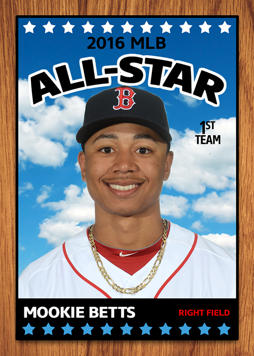
First up is a bit of a retro recreation. I was searching ebay for random Bruins hockey cards and came across 1966 Topps Hockey. The base set is the “TV Screen” motif you’ve probably seen in older Bowman baseball, but the “All Star” inserts were different. They had some wood-grain, a cloud background reminiscent of Goudey or UD Masterpieces, it was this weird mishmash of stuff but it all kind of worked. Here’s an original…LINK. And here’s my custom recreation, using one of last years baseball All-Stars:
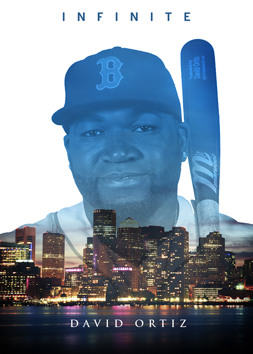
Next up is my take on Topps Bunt’s “Infinite” cards. Yet another set that is limited to exist only in digital app form and never actually in the hands of collectors. Also, the only representative of the Red Sox happened to be Hanley Ramirez, who is perfectly fine, but will never really be as “Infinite” as, let’s say, this guy…
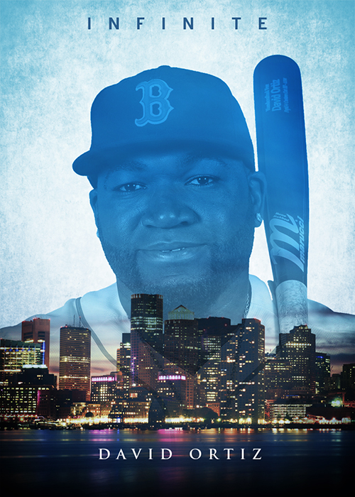
Also, to make the digital only distribution MORE ironic, there was also a “limited” version of the cards (cause, you know, digital means there’s no way to make more copies, lol) which was “frosted” for some reason. Icey blue with a touch of Elsa, or something like that…
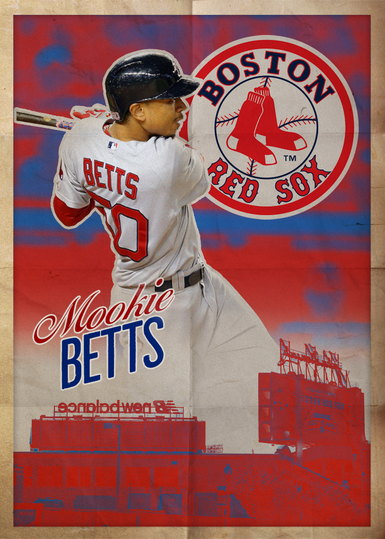
Next, another take on another Bunt insert. They had a “Poster” insert at some point (I don’t even know when, I just follow the designers on twitter, I uninstalled the stupid app ages ago) which had two creases, and was more square than an actual poster. That just didn’t sit right with me, it was lacking most of the cool aspects of any actual poster you’d have on your wall. So, I came up with this instead…
Over the next few, you’re going to see that photo of Mookie quite a bit. A) Because it’s awesome, but also B) I spent the time to cut it out, and that sort of thing shouldn’t go to waste.
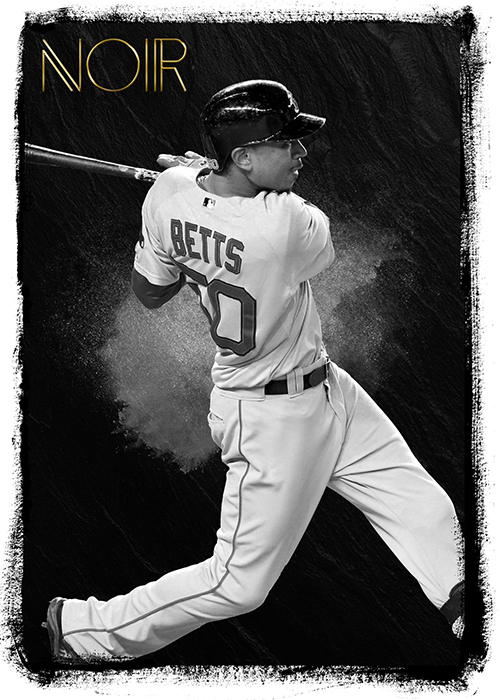
Next up is my take on Panini NOIR Soccer. I may not like soccer, at all, but that doesn’t stop me from looking at some of the designs the super talented folks over at Panini are coming up with. NOIR is a brand that (I think) is limited to just soccer and basketball at the moment. No NOIR Baseball. Noir is the French word for black, so the cards feature an almost completely blacked out design, with just subtle textures. Most of the photos are black and white with a few colored ones being parallels. In my version, the “foil” stamping is the only splash of color…
For the font on the “Noir”, I used the awesome retro freebie font “Anders”. Link.
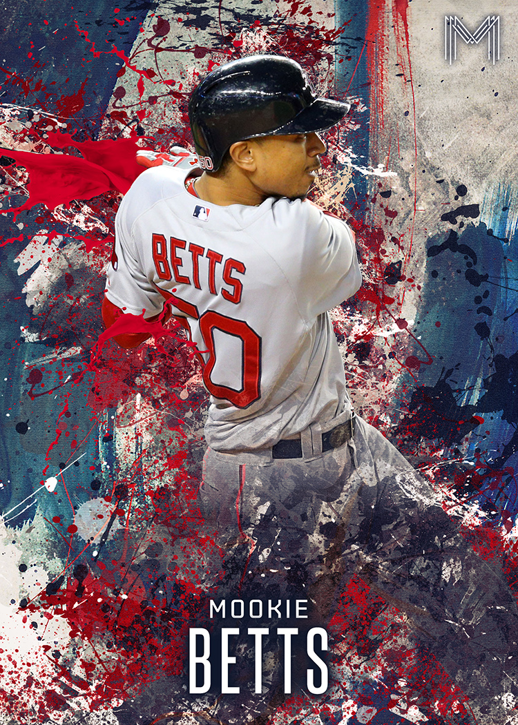
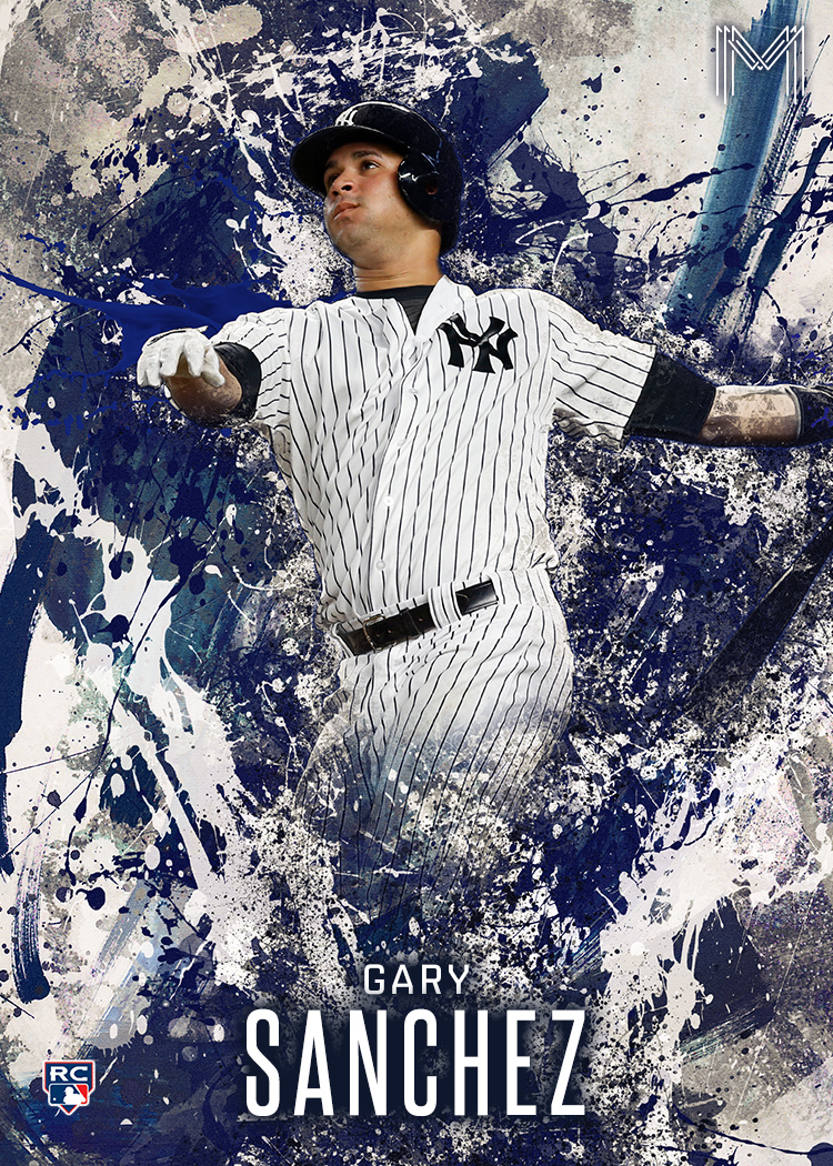
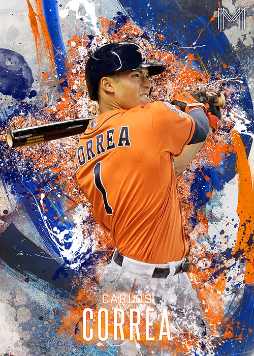
Next up is my take on the “Fire” brand of cards, although now that I’m looking at them again, they tend to be more “paint splatter” than “fire and smoke”, but I don’t care. It was the idea I ran with. That just makes it even more mine. So, these were “inspired by” Fire. There, that makes more sense. I had shown off the Mookie version a couple weeks ago, but I also did a Sanchez for AJ and a Correa for Sam that I’ve never shown. I plan on actually printing these at some point and including them in card packages. I’m still searching for the perfect card stock to print them on.
I think those turned out pretty well. If you’re curious about those fonts, I used Steelfish and Shentox Medium for the upper and lower names respectively.
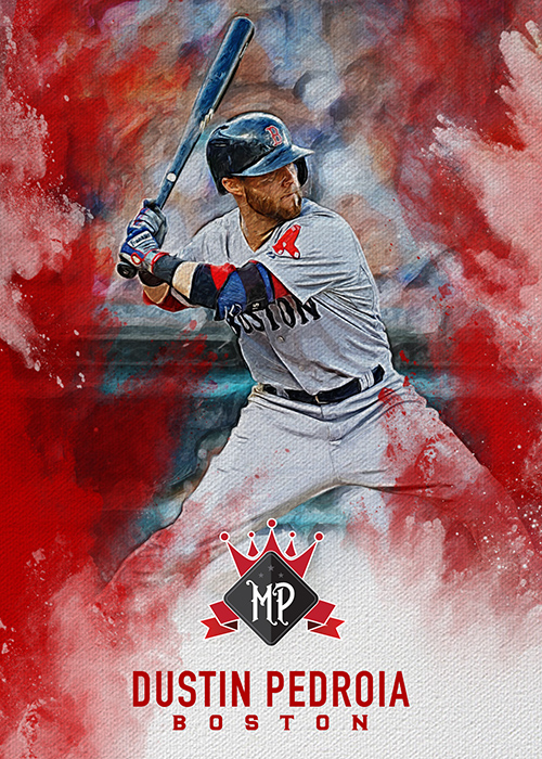
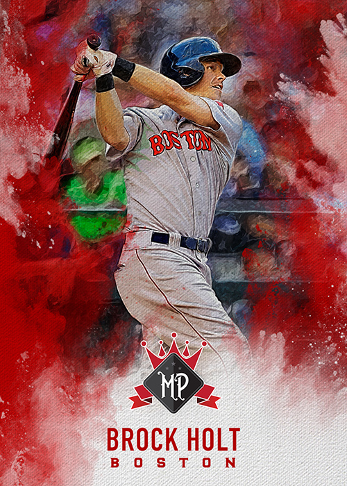
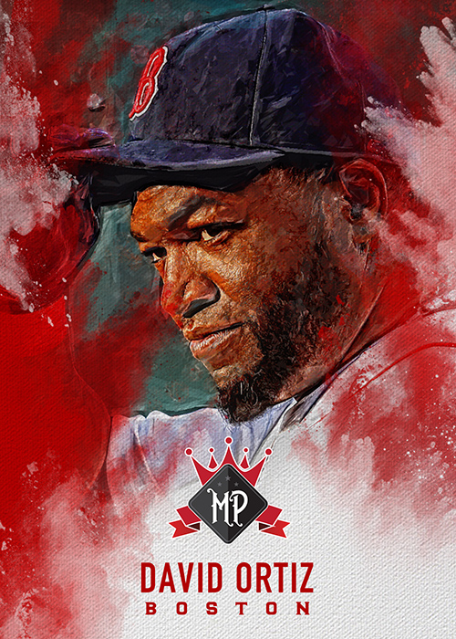
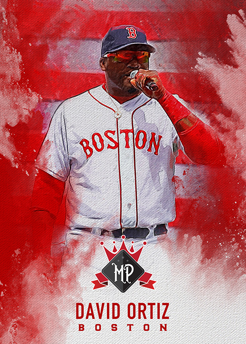
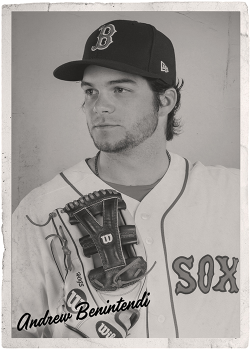
Next is my take on Diamond Kings this year. I teased this last week by making my own Betts variation, but I was more interested in adding some of the cards that weren’t in the checklist. This year there were quite a few omissions in the checklist. There were 5 classic players but only 3 modern ones. There was no Pedroia, Bogaerts, JBJ, Holt, Kimbrel, Sale, Porcello, etc, etc. So, here are a few I came up with to fill in the gaps…
and, just because, a photo variation…
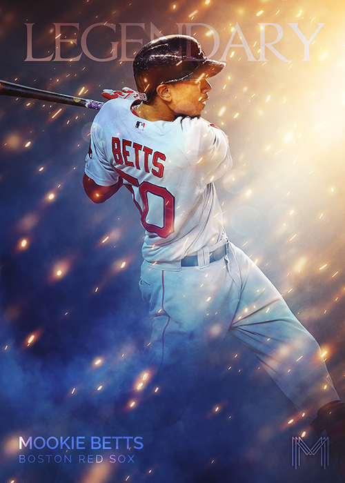
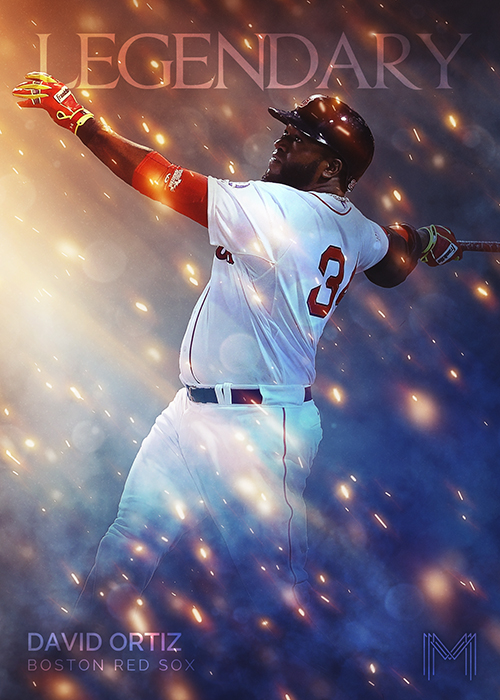
Next, a completely custom idea. Inspired by a bunch of elements from other things, but I didn’t base it on anything in particular. This was just trying out some Photoshop techniques and they just kind of came together. I present… “Legendary”…
Two more designs and we’re done. You still with me?
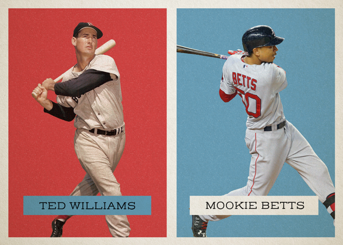
This one was inspired by one of the “Throwback Thursday” designs Topps has been doing. I never saw the back of the real card, so I don’t know what set they’re drawing inspiration from. The original had Ted Williams on one side, and Mookie on the other, but the photos didn’t quite jive. Williams was up-close and portrait style (probably from an old card) and Betts was an action shot from further back (full figure). They didn’t quite work together. Also, they went with orange and teal. Blah. Here’s an improved version…
If you look close at that one, I actually recreated the half-tone effects and used an older cardboard texture. For you font-aholics, the font I used on the name plates is the super awesome “Henderson Slab”.
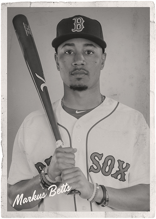
Last but not least, just for giggles I went old school, really old school. 1936 old school.
Those are my recreations of 1936 “R314” Goudey cards. The names, from what I can tell, where hand drawn onto the originals (probably on the negatives) as the letters seem to be unique from card to card. I used Handelson One, which seems to be a good fit to the style of the originals.
That’s all I’ve got for today. I had fun making these and exercising the creative muscles a little bit. If anyone has any suggestions on something you’d like to see recreated (already working on GQ), let me know. I’m always up for a challenge. Thanks for reading!

One word — AWESOME!
You have some amazing talent. Minus the subject matter, I’d love any of these cards. And I can’t wait for the Sanchez.
Love the Infinite. Reminds me a little of a modern day this:
https://images-na.ssl-images-amazon.com/images/I/91rdvmoLMpL._SY450_.jpg
Great work
Excellent work. You’ll be happy to know that the Infinite insert from Bunt is coming to the physical version.