More Customs
This wasn’t actually the post I planned on making today. I had a great time with Sam at the card show in Houston this past weekend and had planned on post some of the cards I picked up. They’re scanned, but they’ll take a while to crop and whatnot. Instead, I’ve got something else up my sleeve. I realized I had been showing off random custom cards on Twitter more than I had here, which was a huge oversight on my part. I had made web sized previews of everything, but had never posted them. So… you ready for this? Nearly every custom card I’ve made since LAST APRIL. There’s even a couple previews of works-in-progress that I haven’t gotten around to finishing. Let me know what you think, and which ones are your favorites.
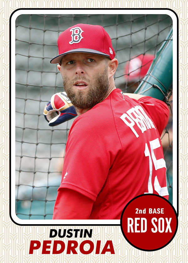
2017 Heritage Re-work
Let’s start off easy. This one is a rework of 2017 Topps Heritage. There’s nothing really wrong with the 1968 design layout wise, but there were two things that bothered me about both ’68 and it’s Heritage re-hashing. The colors of the circles, and the background texture. It never made any sense to me why the circle colors had nothing to do with the team colors. If I remember correctly, the Red Sox in that set were on bright pink/magenta. The other problem the circles always seem to have were off-centered printing. The text almost never landed in the middle of the circle. Lastly, the “burlap” pattern might have been fine in 1968, but it’s ugly as heck today. So, while I kept the basic idea, I fixed the colors to correct team colors, centered the text, and replaced the background with a retro art deco pattern rather than the texture.
Also, I followed in Topp’s footsteps. There’s regular and “short printed” photo variations, and a SSP variation I made just for Sam.
Topps Finest-ish
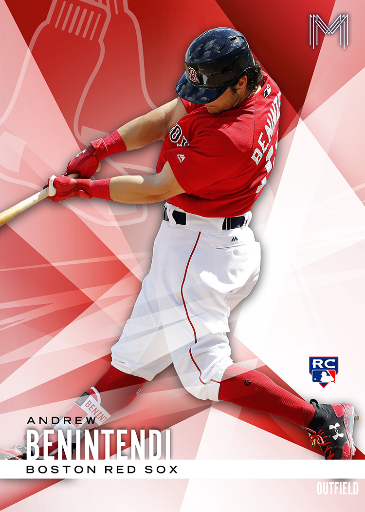
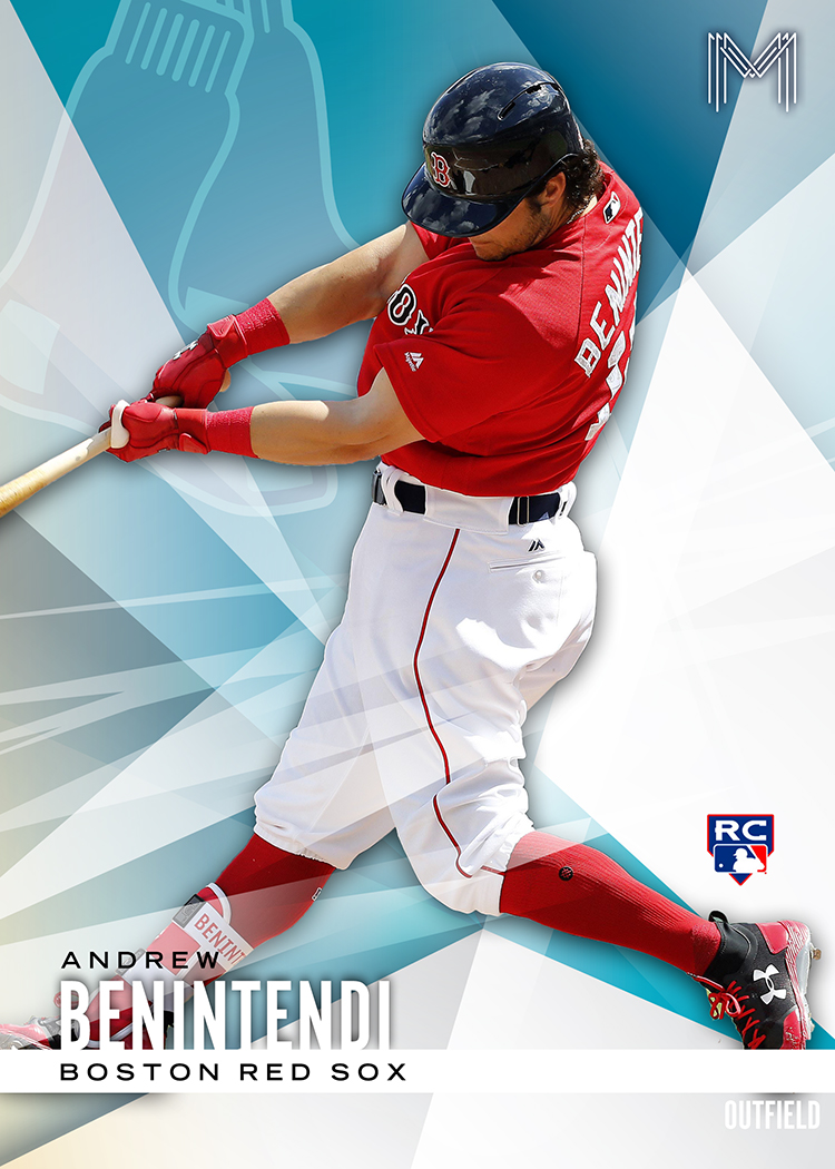
Next up, Finest. Sort of. I wanted something to try out some reflective material I had found. Finest, having been originally known for it’s refractors, is now all about the crazy variations and patterns. I tried out a couple different combinations (digitally) as well as actually printed on various materials. Had fun with this one.
1980 Topps Basketball
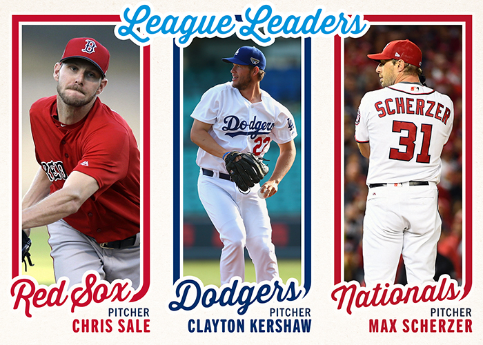
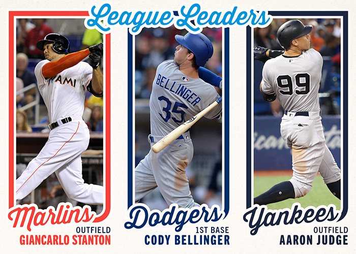
I don’t collect basketball cards, but I am aware of several iconic ones. The most iconic card, to me, is probably this one. A 1980 Topps basketball card with Larry Bird, Dr. J and Magic (technically it’s an RC for both Bird and Magic). The font is funky, a throw back to the 70’s, the colors make no sense, and the weirdest part is that it’s perforated, so you could pull it apart into 3 mini cards. That’s just crazy. I like crazy, so I turned it into a baseball card instead. Team appropriate colors, a rookie card, and then a couple takes on “league leaders”. Also did a “dirty” version, in case it’s been sitting in a shoebox in the basement all this time.
Immaculate
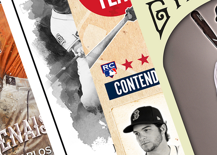
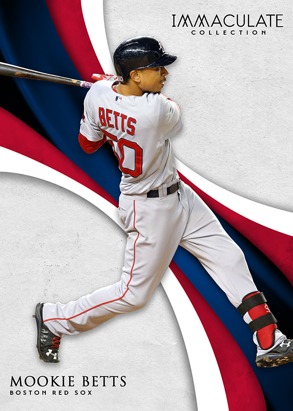
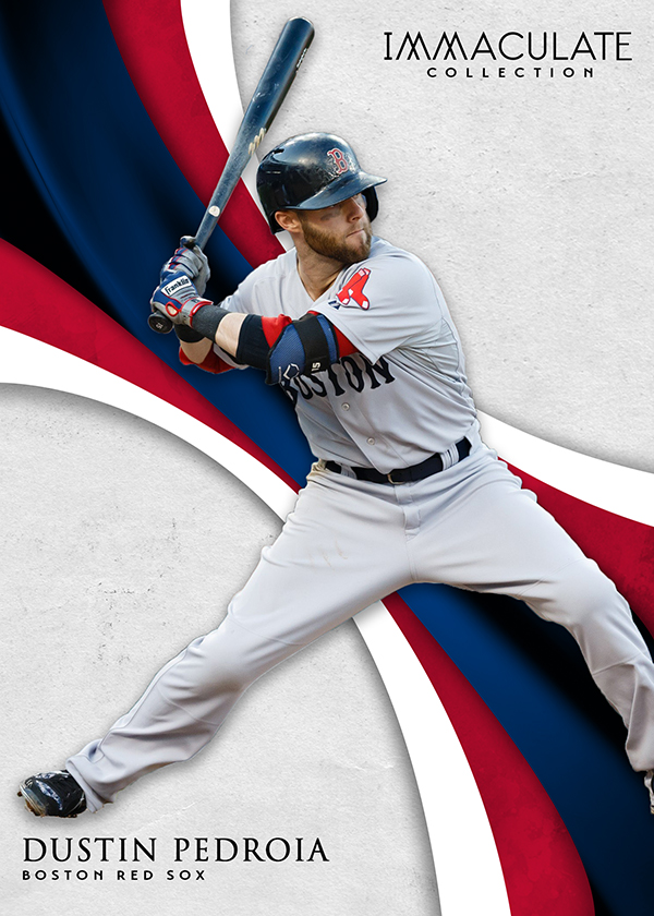
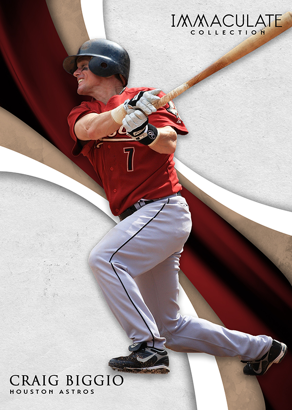
One of the things I try to do a lot is to recreate stuff that’s out of my price range. I’d never open a box of Immaculate, or National Treasures, or 5-Star. I just don’t have that kind of money. So, I try to make some instead. This is a take on Panini Immaculate. I ended up actually printing these and replacing the colored bands with foil. I was pretty happy with the results.
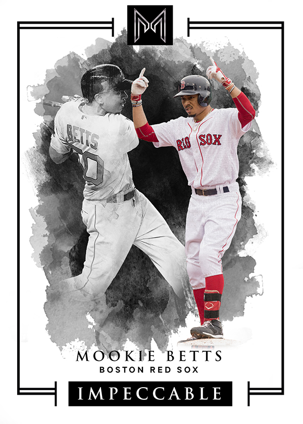
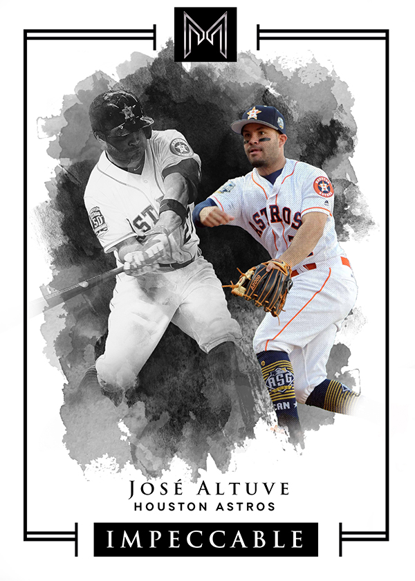
Impeccable
This is pretty much the same idea as Immaculate, only with a different product. These were inspired by Panini Impeccable, which I think is a football and racing product. I thought it could use a baseball version, and I just love playing around with ink/splatter brushes.
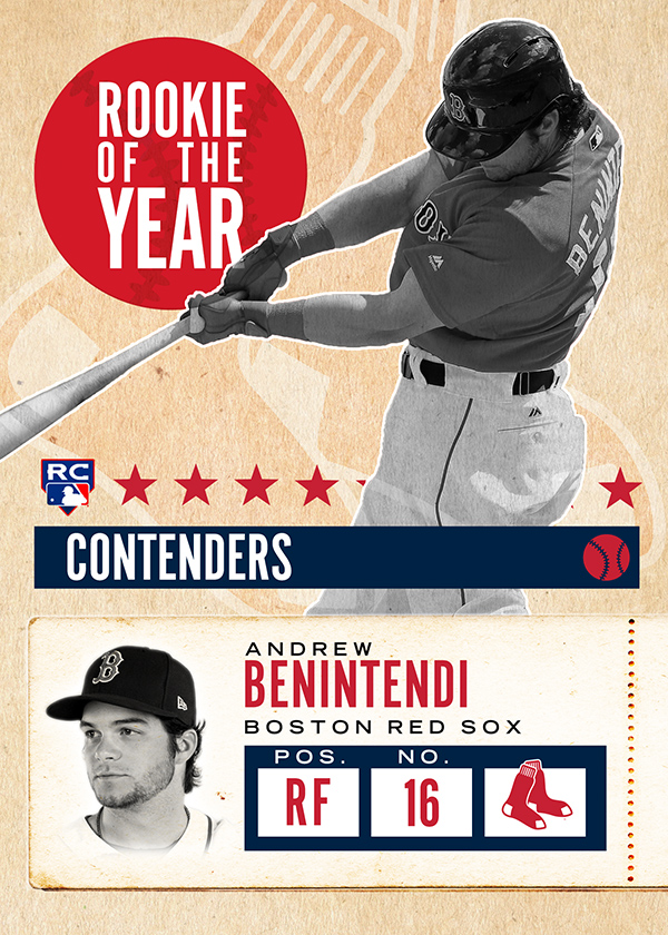
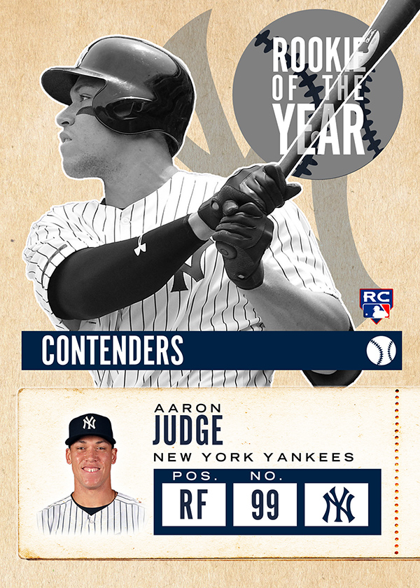
Rookie of the Year
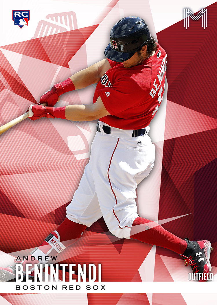
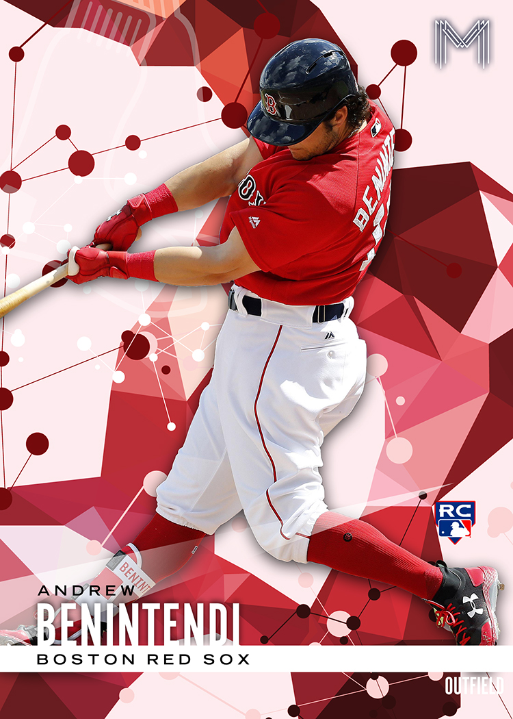
These were a take on Panini Contenders Football, and an insert set within it. I believe it was something along the lines of “Ticket to the Show” or “Draft Ticket”, emphasizing up and coming rookies. Baseball isn’t quite so immediate with their draft results, having players go through the minors, but I liked the idea of the ticket stubs anyway. So, “Rookie of the Year: Contenders” was what I came up with. Someone kinda ran away with that award, but let’s pretend there were other candidates. Truly, I should have made a couple more after the playoffs were over, but this was back in July/August.
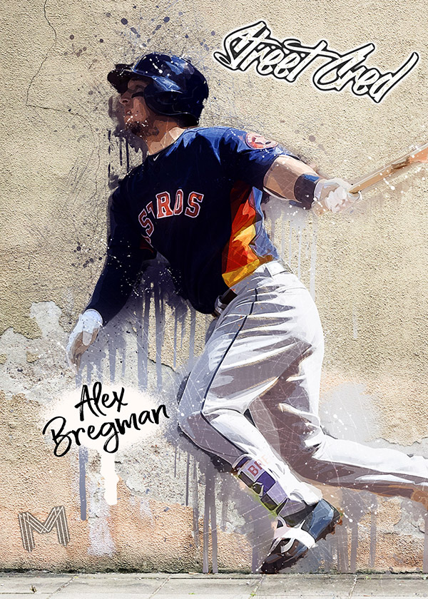
Street Cred
This one just came out of boredom one day. I had gone down to see an Astros game mid-June and there’s a whole area next to Minute Maid park with some above average graffiti. I thought it might be cool to see some actual baseball graffiti, and here we go.
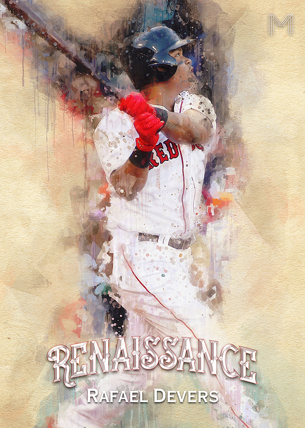
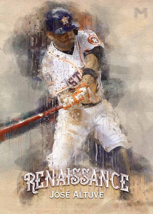
Renaissance
Was trying a different painting action and this just kind of happened during the playoffs. I was pretty down at that point with the hurricane and everything, and was just messing around in Photoshop to blow off some creative steam. Might go back and rework these later, not 100% happy with the results, but it’s a good start to something.
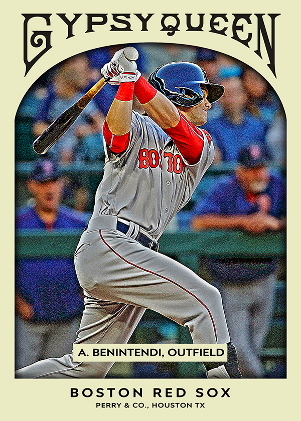
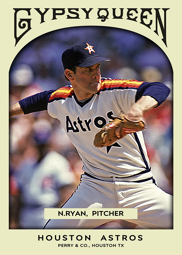
Gypsy Queens
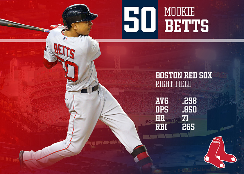
My love of all things Gypsy Queen is well documented. It should be no surprise to anyone that I made some customs. I’m still forever in love with the original, and the 2011 original remakes. The arch, the old-timey yellow. One of my favorite sets of all time.
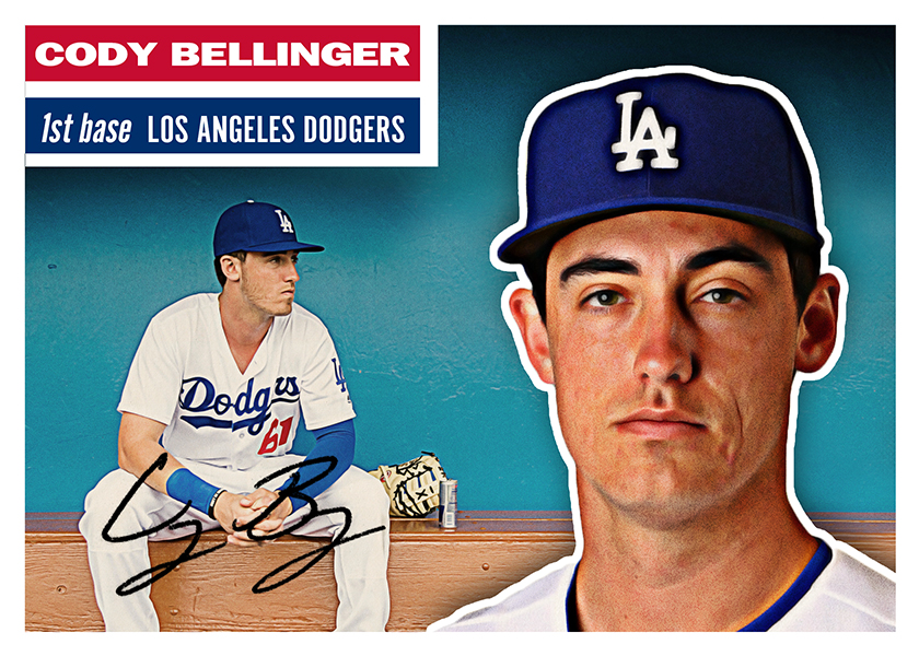
1956
I love the idea of vintage cards, but it’s just not my jam. I can appreciate the designs, and the history, just not the price tag and that constant and endless search for cards in better condition. That said, I wanted to take on the classic 1956 design. I liked the double photos/paintings of players and the bright colors. These were just kind of an experiment, but turned out pretty neat in the end. Finding the right photos was really a struggle on these. Decided to use team appropriate colors as well.
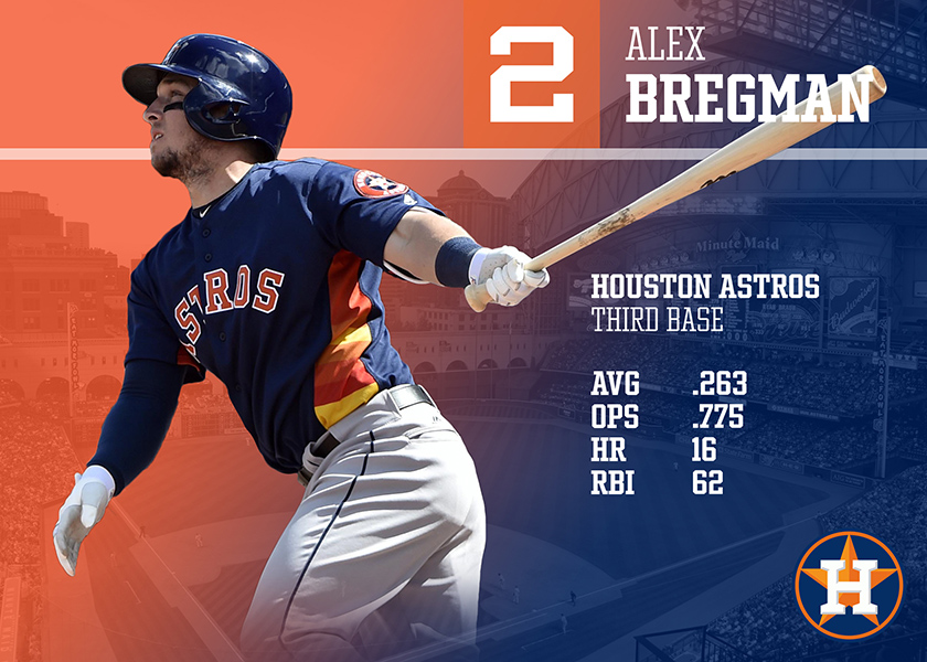
Stadium Stats
The inspiration for these came directly from Minute Maid park and their graphics department. The scoreboard in center field features graphics very similar to this for each player as they come up to bat. I thought it might make a neat looking card and made some tweaks. The stadiums in the background for example, and obviously a simplified stat line.
Box Loaders / Cabinet Cards
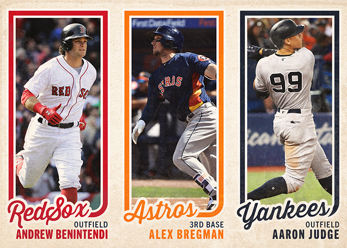
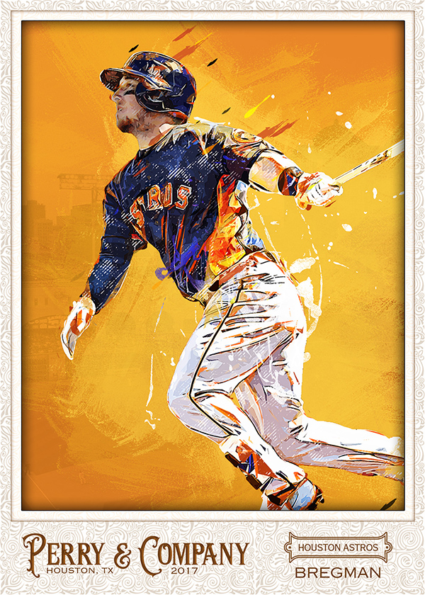
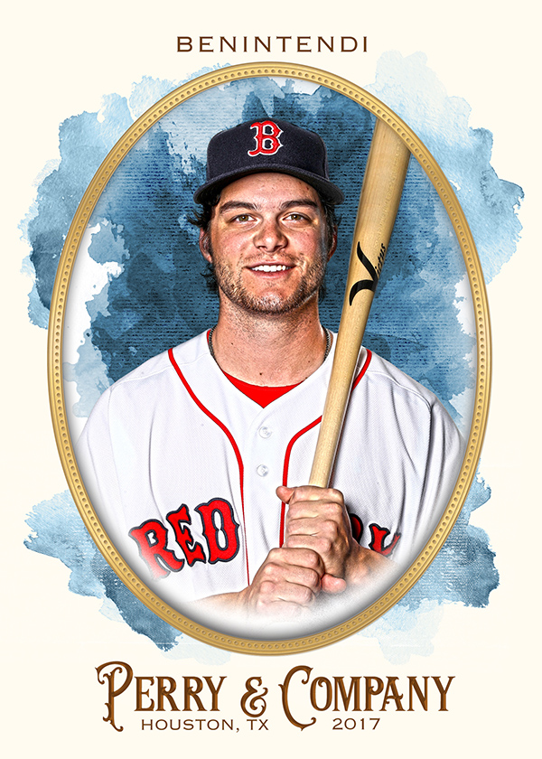
So, here’s a weird one. When Allen & Ginter came out last year I really liked the look of the purple/retro box loaders they came with. Trouble was, the photos they used were studio shots of the players superimposed into vintage studio scenes. I had neither of those to work with, so they kind of mutated into something else. Added a pattern background, awkward name plates, etc. Then did a 180 and decided to make them more painterly. Kind of a weird, retro mashup. They look ok, especially the Bregman, the yellow really pops, but I’d probably redo them if given the chance.
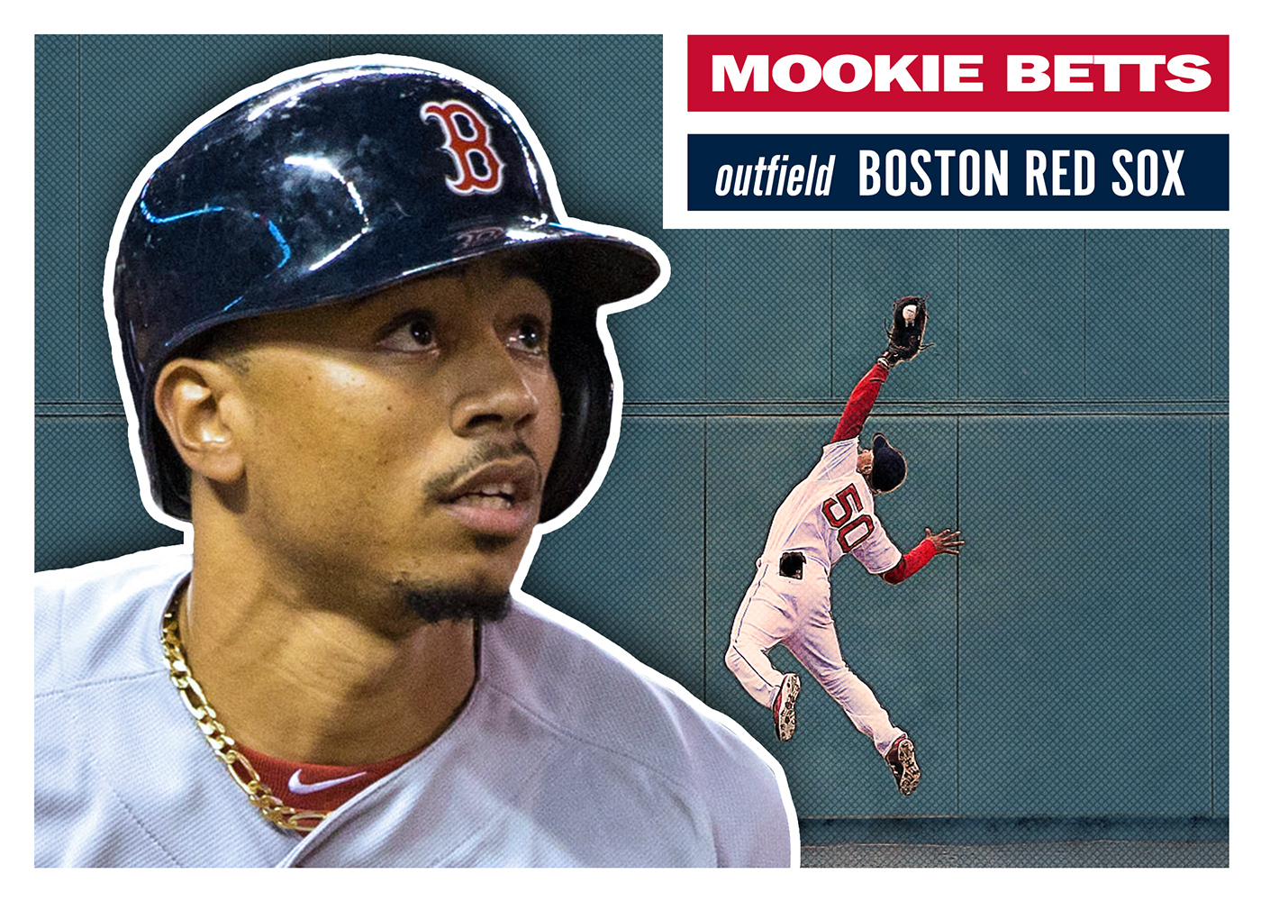
Then and Now
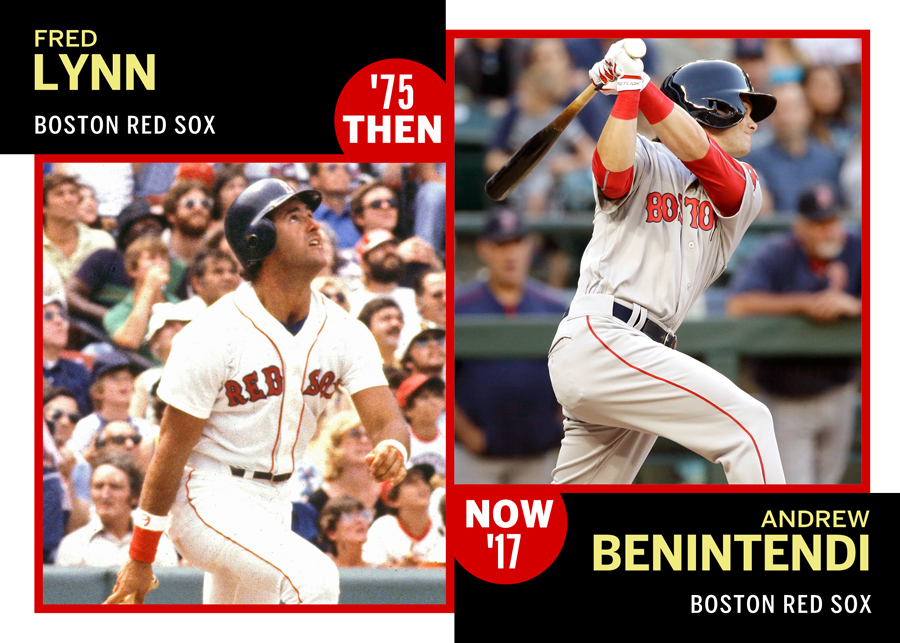
I did a take on Heritage’s “Then and Now” in my first custom post last year with Ted and Mookie, but I went really retro with it. These were inspired by 2011-13 Heritage, which I thought did a better job than 2015-17 with that particular insert set. Just an FYI, the fonts are accurate to the originals in these (and most of the others as well). If anyone wants to know what a specific font was, just let me know.
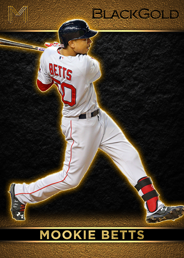
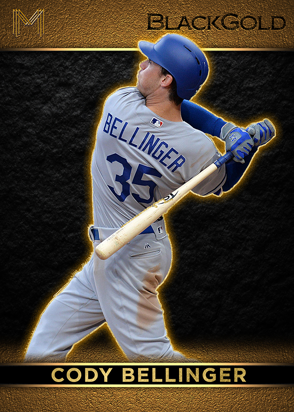
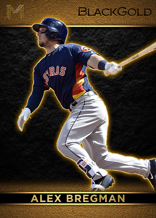
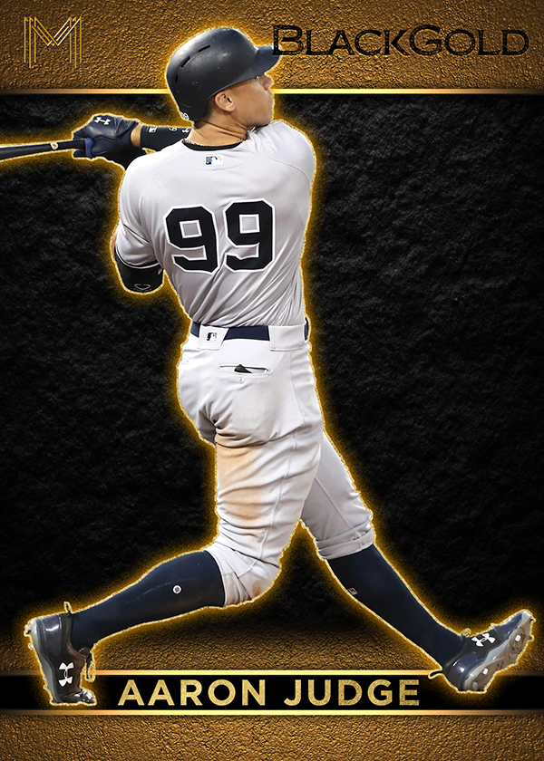
Black Gold
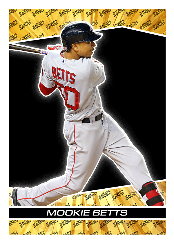
These are the most recent customs I did. I did these back in January when the blogosphere was going bonkers over the 90’s originals. I started off with a fairly accurate recreation, then spun it into it’s own updated version. I couldn’t match the “Topps BlackGold” repeating endlessly in the background of the originals, but let’s just assume I didn’t feel like writing “Topps” over and over again into a pattern. The updated version are more “gold as in texture” (tops and bottoms) but keeps the “halo” around the player and team-less name plate as a tie-backs to the original.
Rated Rookies
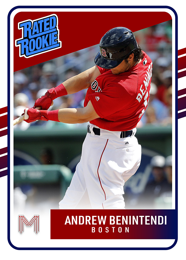
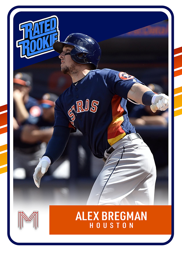
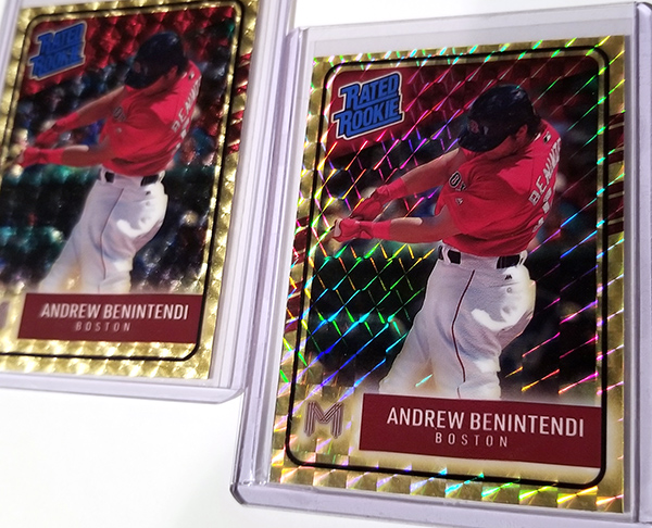
Around the time Donruss came out last year, I was having a real hard time finding some. I really liked the retro look and I think Panini did everything right with 2017 Donruss, especially the Rated Rookies. I love them. These aren’t really different from the real ones, with a few minor tweaks here and there. This was just a strait up “re-creation” card. I did add some gradients to the background stripes, but that was just for the heck of it. This was another card I wanted to make to test out printing materials. These look awesome in real life on superrefractor material.
One-offs
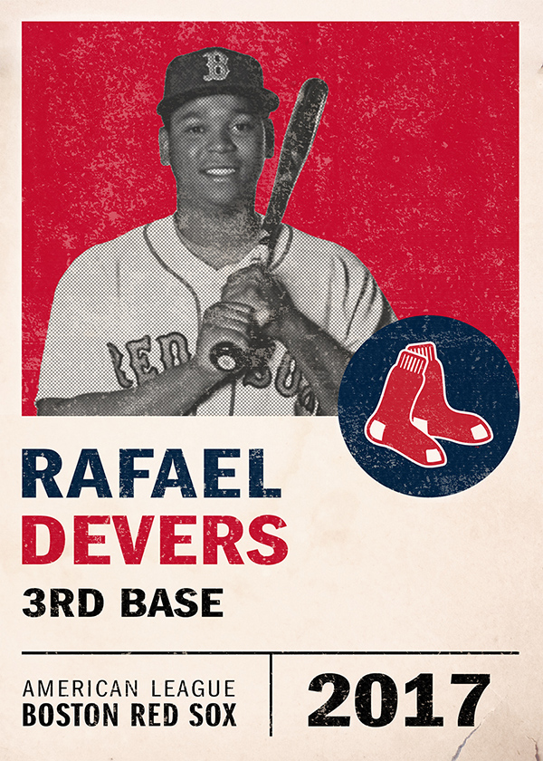
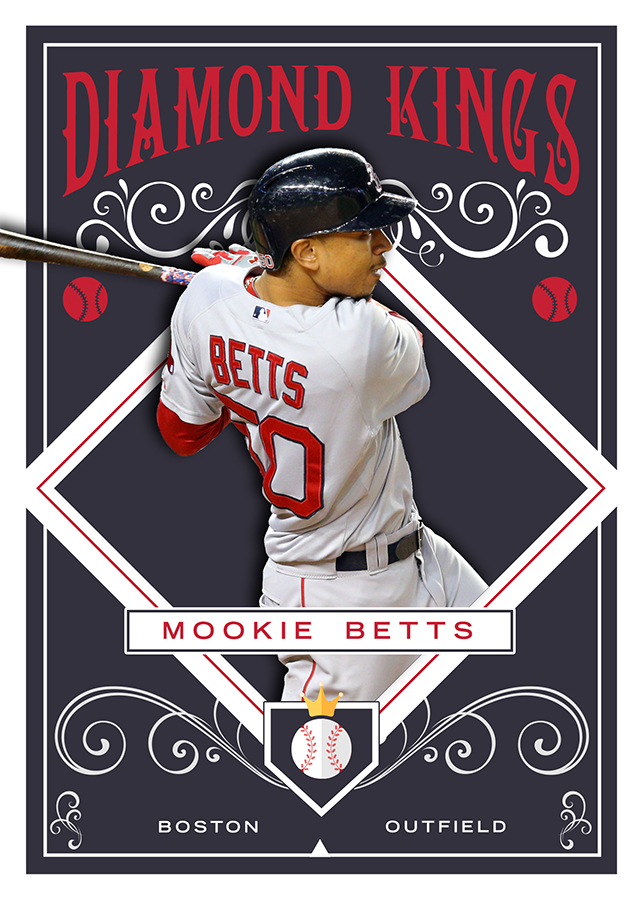
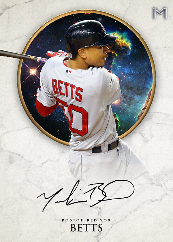
Some times I was just trying out an idea. Some times maybe I just wanted to do one card instead of a bunch. Here’s a couple random cards that didn’t really go with a group. There’s a “1914” inspired Devers where I was experimenting with the layout and fonts. There’s a 2012 Elite style Diamond Kings (before DK was a brand again), there’s a take on 2017 Ginter that I wasn’t really crazy about (not the custom, Ginter in general) and a Topps Star Wars Autos inspired “Galaxy” card.
Works in Progress
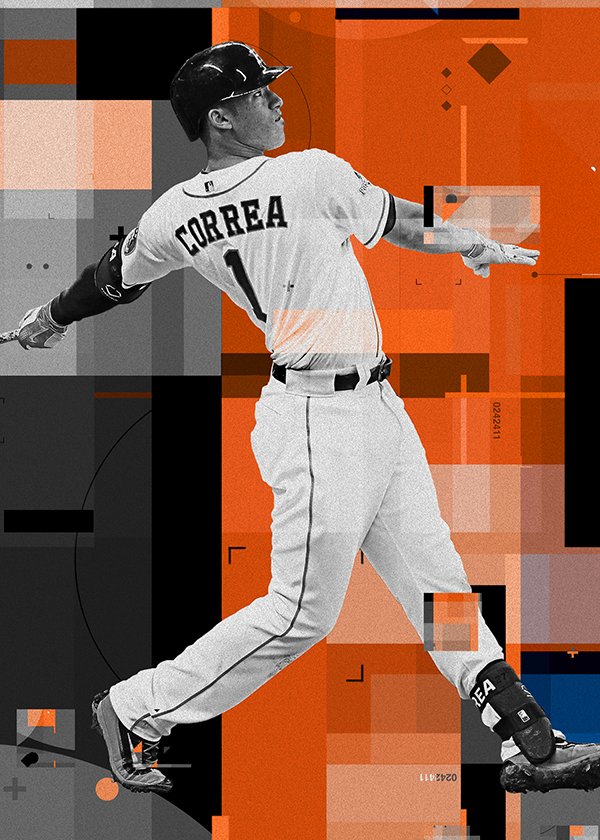
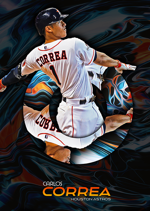
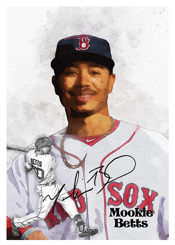
Lastly, some stuff I’ve been working on that I never got around to finishing. There’s two “modern” cards, sort of a take on “Tek meets Finest”. There’s also a “Fire” inspired, super abstract with retro flare sort of thing with Correa (mostly because the orange and blue really pops). Lastly, I probably don’t need to even say the name, but I’m working on my take on the infamous Perez-Steele cards.
So, there we have it. Phew, that was a ton of stuff. Sorry for the insanely long post. I hope you guys like these, I certainly enjoyed making them. Thanks to the folks on twitter for providing input on some of these, it’s always appreciated.
Thanks for reading!



















Recent Comments