Cards
2019 Heritage – Design Breakdown
Grey is very in this year…

Matt “Doc” Perry
March 5th, 2019
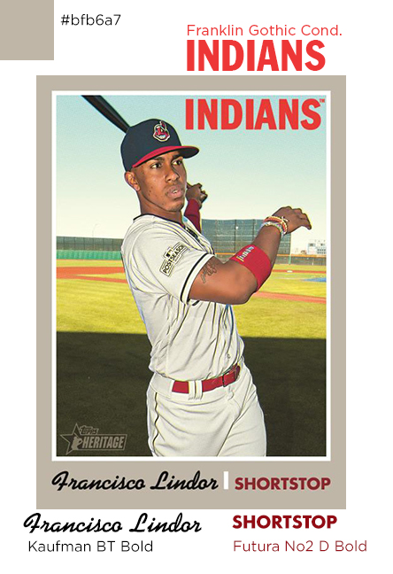
It’s not going to come as much surprise that this breakdown took all of 20 minutes. 1970’s Topps isn’t exactly known for it’s intricate design. I mean, a grey box doesn’t really need to be “broken down”. That said, I figured I’d at least take a look at the fonts and try and nail those down. At least that way I can share with those of you who like making your own customs, and I can have them in my back pocket for doing a “Heritage-esque” card later on.
So, what are we dealing with? For starters, two classic fonts with long lineages and one more whimsical one for the names.
Up top, for the team names, you’ve got the always classic Franklin Gothic, with what I’m thinking is the Condensed variation.
At the bottom, for the player position, a version of Futura called No.2 D, and the Bold version at that.
The name was slightly trickier, but I’m 98% confident it’s Kaufman BT Bold. It could also be “Cafe Script”, they’re very similar, but I’m sticking with Kaufman.
After that, it’s really just boxes, grey, and a nice photo. The grey looks to be #BFB6A7, at least in my monitor’s color profile.
That’s really all there is to this one. A nice simple design that we can build on for something truly custom down the road.


Nice info! I’ve done some simple image modification before but never custom baseball cards. Very cool!